

A living room is the one wall in a house that people look at for hours without meaning to. That changes what works there. A print that is clever on first sight becomes tiring by the third week, while a drawing with real structure underneath keeps giving something back: a line you had not followed, a shadow that turns out to be a doorway.
The pieces below are drawn on location — buildings measured by eye, coastlines watched through moving weather — which is why they read as calmly at four metres as they do at forty centimetres.
Size it to the sofa, not to the wall
The most common mistake in a living room is a print that is too small. Work from the furniture: the artwork should span roughly two thirds of the width of the sofa or sideboard beneath it. For a standard three-seater of about 210 cm, that means a single print 100–140 cm wide, or a pair of 50–70 cm sheets hung with a hand's width between them.
If the ceiling is high, gain height rather than width — a portrait-format architectural drawing draws the eye upward and makes the room feel intentional instead of stretched.
Hang lower than instinct tells you
Centre the artwork at about 145–150 cm from the floor, and leave 15–25 cm between the top of the sofa back and the bottom of the frame. Hung higher, the print floats loose from the furniture; hung within that band, wall and seating read as one composition.
In a room where people mostly sit, dropping the centre by another 5 cm is often better still — the picture meets a seated eye rather than a standing one.
One strong piece beats a gallery wall
Gallery walls suit corridors and stairs, where you pass. A living room rewards a single anchor with breathing space around it. If you want more than one work, hang two of the same size at a shared centre line and let them behave as a diptych rather than a collection.
Where you do want a pairing, choose contrast of subject and agreement of palette: an architectural elevation beside an Atlantic landscape works because both are drawn in the same restrained range of ink, stone and paper white.
Framing and light
Pale oak or ash with a 5–7 cm off-white mount suits these drawings in most neutral rooms; a slim black frame sharpens them against a dark or deeply coloured wall. Keep the moulding narrow — the drawn line should stay the strongest edge in the picture.
Living rooms are usually the brightest rooms in a house, so use UV glazing if the wall catches direct afternoon sun. Every print is made with archival pigment inks on museum-grade matte stock, which resists fading far better than dye-based printing, and matte avoids the glare a glossy sheet throws across a sunny room.
Prints to start with
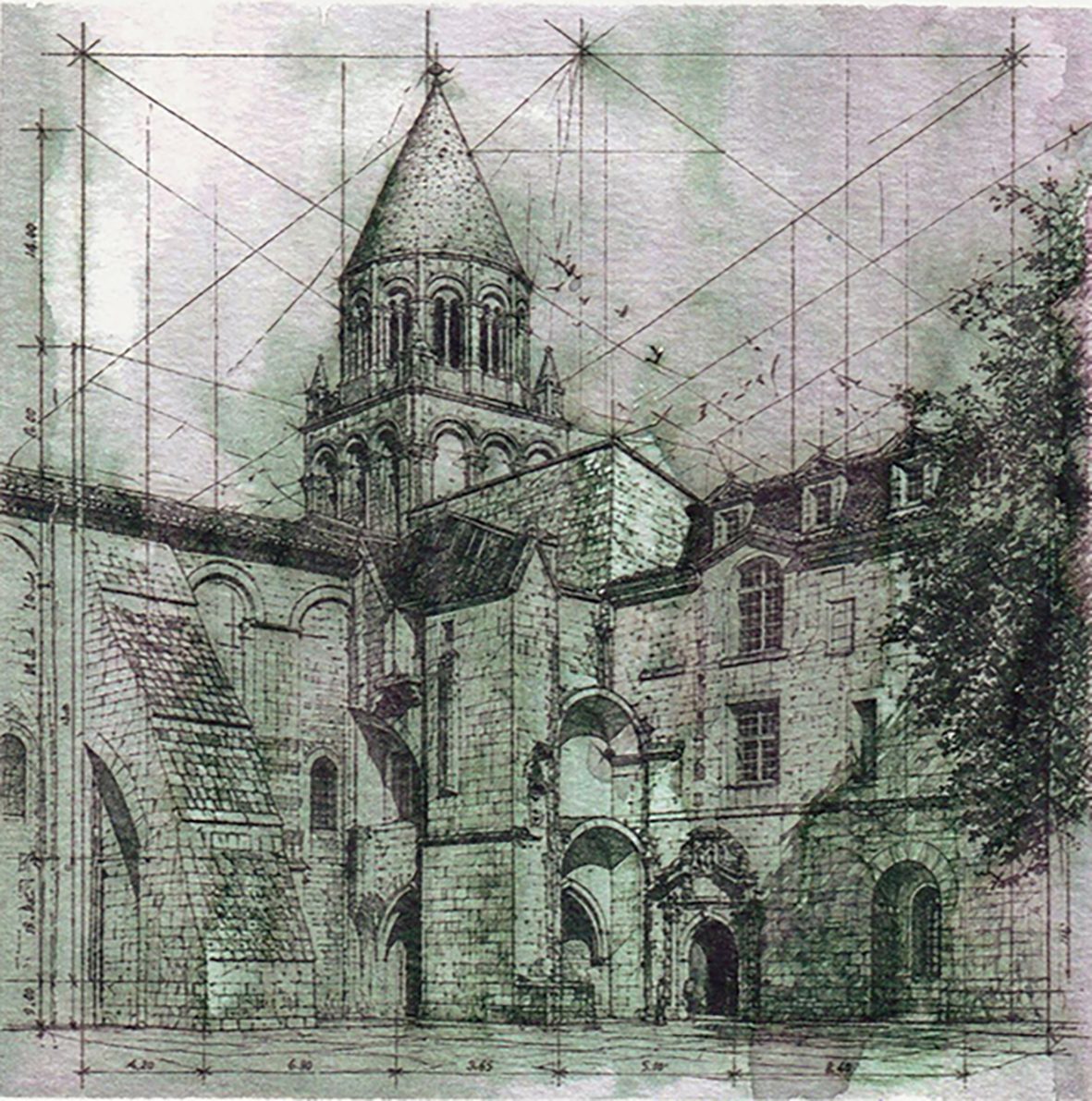
Abbaye aux Dames, Saintes
Ink and wash on paper · Saintes, France
A Romanesque abbey in south-west France, drawn from the square in a single morning. The tiered bell tower is set out with the construction lines still showing, while diluted ink carries the shadow down the west front.
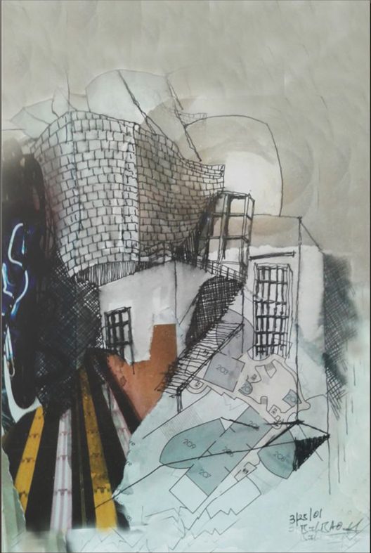
Guggenheim Museum Bilbao
Mixed-media collage · Bilbao, Spain
Gehry's titanium curves rendered in torn metallic paper and ink, so the surface of the print behaves the way the building behaves in Basque light — reflective one moment, matte the next.
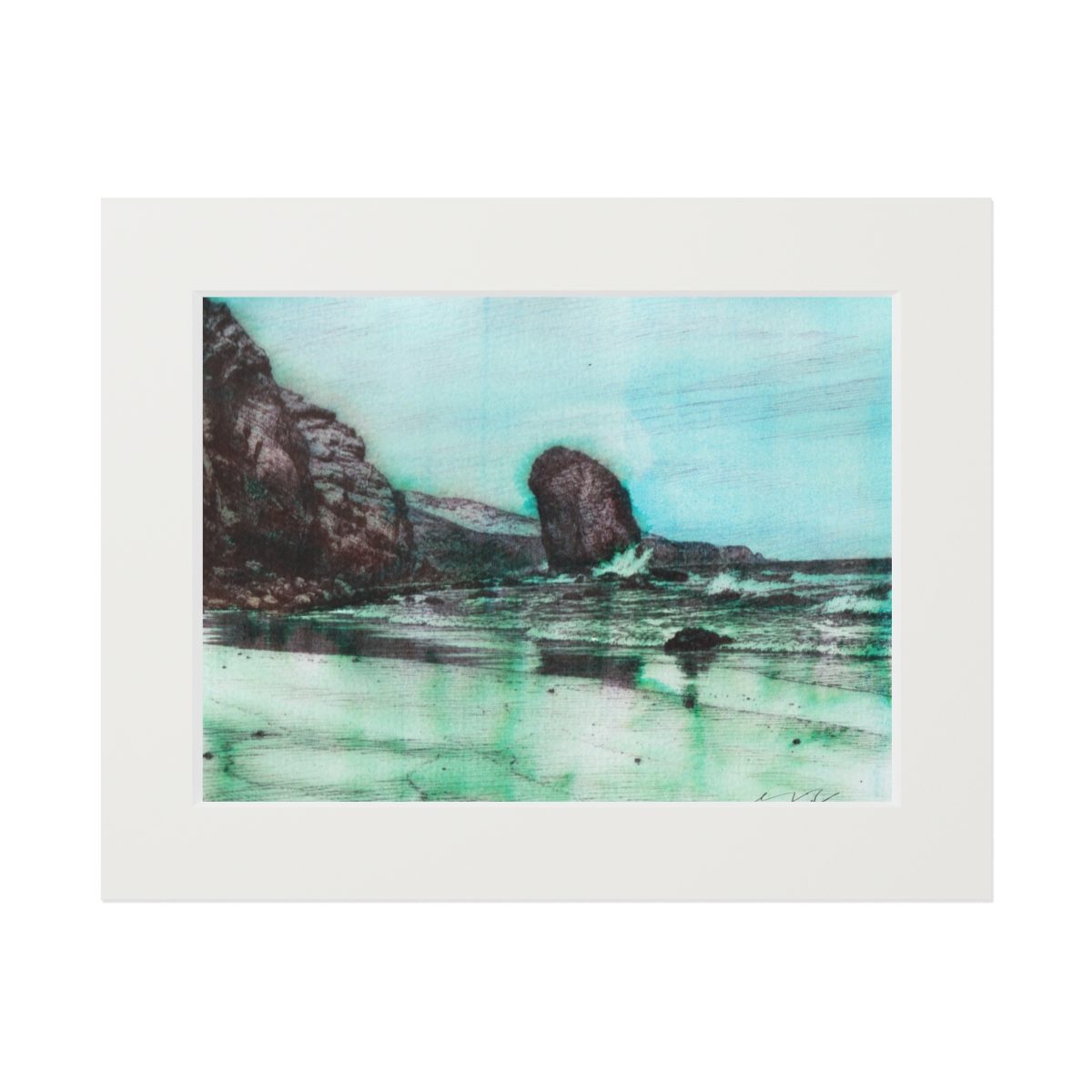
Symphony of Waves
Ink and watercolour on paper · Fuerteventura, Canary Islands
Turquoise water running in around black volcanic rock, with the wet sand holding the reflection. The most colour-led piece in the coastal work.
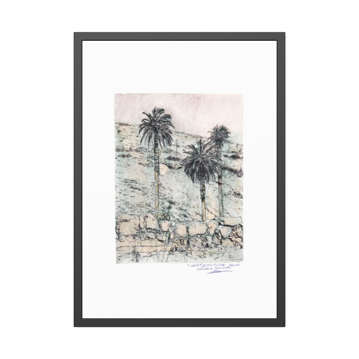
Magical Landscape
Ink and watercolour on paper · Fuerteventura, Canary Islands
Three palms against a terraced hillside wall, high above the sea. A drawing about dry stone, patience, and the few things that grow on a volcanic island.


Questions buyers ask
- What size art print should I hang above a sofa?
- Roughly two thirds of the sofa's width. Above a 210 cm three-seater that means a single print about 100–140 cm wide, or two 50–70 cm prints hung a hand's width apart with a shared centre line.
- How high should living room art be hung?
- Centre the work at 145–150 cm from the floor, leaving 15–25 cm of clear wall between the sofa back and the bottom of the frame.
- Which artwork suits a neutral living room?
- Drawings with a narrow palette — ink, warm stone, indigo and paper white — sit comfortably with oak, linen and plaster. Architectural studies add structure; coastal and volcanic landscapes add quiet depth.
- Do the prints come framed?
- Prints are supplied unframed unless a framed option is shown at checkout, which lets you match the frame to your room. Sizes, paper and framing choices appear on each listing in the shop.
- How long does delivery take?
- Each print is made to order at the production facility nearest you — typically 2–7 business days to produce and 4–20 business days to arrive, depending on destination.
Full terms are on the shipping policy and refund & returns pages.
Choose a living room print
Browse the complete artwork archive or the collections. Every drawing is available as a made-to-order print from the GAK Creations shop, with sizes, paper and framing options shown at checkout.
Shop living room prints